
SPRIG STORE
Redesigning a mobile accessories store into a smarter product discovery experience.

OVERVIEW
SPRIG is an e-commerce platform offering mobile accessories across multiple devices, categories, and brands.
The redesign focused on creating a cleaner and more structured shopping experience while making product discovery easier across a large catalogue.
Key Focus Areas

THE CHALLENGE
With a large catalogue, users can arrive with very different intentions.
Some know their device. Some know the product they need. Others simply want to explore.
The challenge was to create a flexible shopping experience without overwhelming users with too many choices.
“How might we help users find the right product faster while keeping the browsing experience visually clean and engaging?”
THE APPROACH
Designing Around How Users Shop
Instead of creating one fixed shopping journey, the new experience supports multiple entry points.
Shop by Device
For users looking for accessories compatible with their phone.
Shop by Category
For users who know what type of product they need.
Search Directly
For users who already know exactly what they're looking for.
Explore Collections
For users discovering new arrivals, trending products, and curated collections.
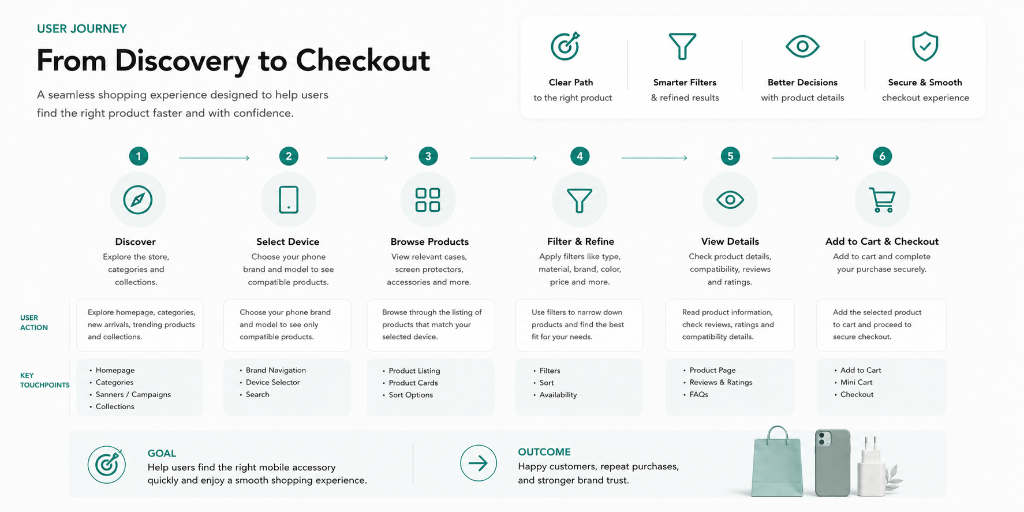
A MODULAR SHOPPING EXPERIENCE
The homepage was designed as a series of purposeful shopping moments instead of one continuous product catalogue.
Alternating between products, lifestyle visuals, and promotional content creates better visual rhythm and keeps the browsing experience engaging.

KEY FEATURES
Device-First Discovery
Quickly find compatible accessories.
Smart Product Filtering
Narrow products based on device, brand, price, material, colour, and protection level.
Curated Collections
Discover trending products, new arrivals, and featured selections.
Clear Product Information
Improved visibility for pricing, ratings, compatibility, and offers.
Category Discovery
A clearer distinction between exploring categories and browsing products.
Responsive Experience
Optimised layouts and interactions across desktop and mobile.
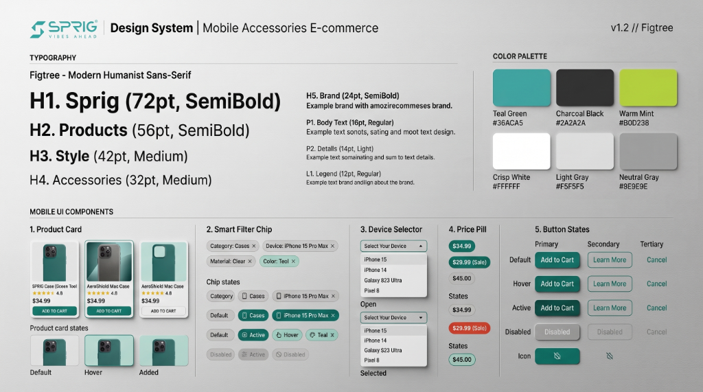
DESIGN SYSTEM
Clean, Consistent & Product-Focused
The visual direction was built around a modern and flexible system.
Figtree
Modern, humanist geometric sans-serif that balances high legibility with friendly authority.
Clean · Structured · Modern
Product-focused aesthetic with generous negative space and clear visual hierarchy.
Hierarchy & Components
Clear hierarchy, generous spacing, and consistent reusable components across all funnels.
The design system was created to scale across different categories, devices, collections, and campaigns.
BEFORE & AFTER
From Browsing Products to Discovering Products
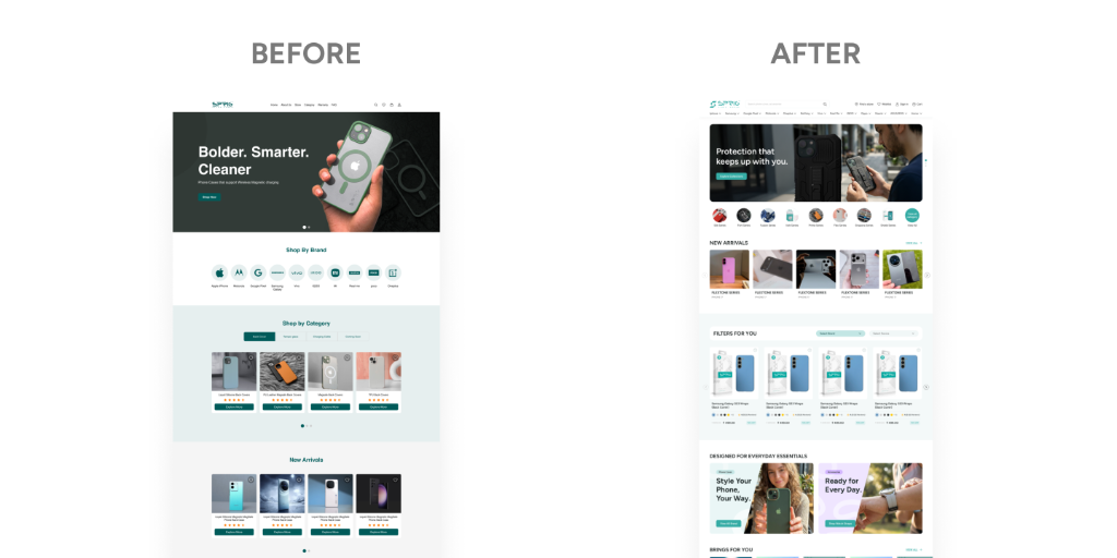
The Redesign Introduced:
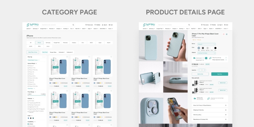
CATEGORY & PRODUCT DETAILS EXPERIENCE
Exploration → Product Decision & Purchase
The experience separates two critical shopping phases — broad discovery and focused purchase decision.
Category Page
Designed for exploration and discovery.
Users can browse different product types, filter by phone model/brand, and explore cases & accessories with smart faceted filters.
Product Details Page
Designed for evaluation, selection, and purchase.
Users can inspect photo galleries, switch colors/devices, review specifications, and add to bag or buy with zero friction.
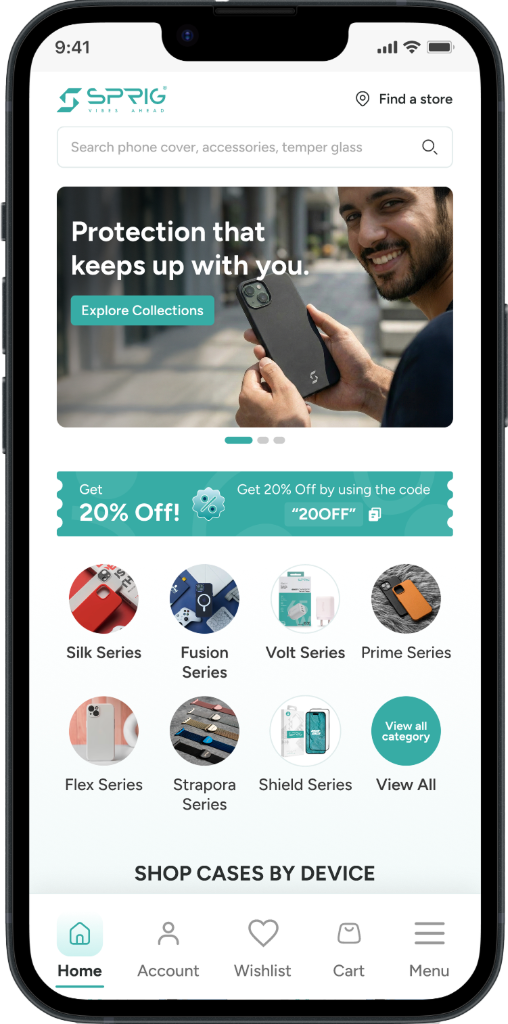
RESPONSIVE EXPERIENCE
Designed Beyond Desktop
The mobile experience was redesigned specifically for smaller screens rather than simply scaling down the desktop layout.
DESIGN VALUE
The new modular structure creates more opportunities for both users and the business.
Better Product Visibility
More intentional sections help surface products across the catalogue.
Flexible Merchandising
New launches, campaigns, and seasonal collections can be promoted easily.
Scalable System
The design can grow with new devices, brands, and product categories.
Stronger Brand Experience
A consistent visual language creates a more cohesive and premium shopping experience.
KEY LEARNINGS
Different users start differently.
Supporting device-first, category-first, and search-first journeys makes product discovery more flexible.
More content doesn't have to mean more complexity.
Strong hierarchy and modular sections can organise a large catalogue effectively.
E-commerce is about reducing decision friction.
The goal isn't to show everything at once, but to help users find what matters faster.
A scalable system matters.
A growing e-commerce platform needs reusable patterns that can adapt over time.