PAYTIME
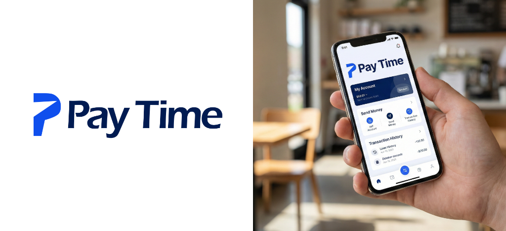
A stylized “P” representing both Pay and Time, with a forward cut symbolizing money movement, speed, and digital financial transfer.
BRAND COLORS
The PayTime color system pairs an energetic electric blue with an authoritative deep navy, striking the perfect balance between financial velocity and institutional trust.
CONCEPT
“A stylized ‘P’ that represents both Pay and Time, with a forward cut that symbolizes money movement, speed, and digital transfer.”
The mark is bold, geometric, and clean, crafted to keep the identity simple, modern, and memorable across every medium.
Pay + Time
Seamlessly unifies the concept of rapid digital settlement with the letterform ‘P’.
Directional Cut
Negative space diagonal cut projecting forward momentum, velocity, and fluid currency flow.
Geometric Simplicity
Constructed without unnecessary ornament to ensure instant legibility at 16px or 100ft.
HOW THE LOGO WAS CREATED
“The logo is constructed from a geometric ‘P’ with a directional cut, creating rapid visual momentum and financial flow.”
“The form was refined on a grid and aligned with the wordmark to ensure balance, clarity, and scalability across all platforms.”
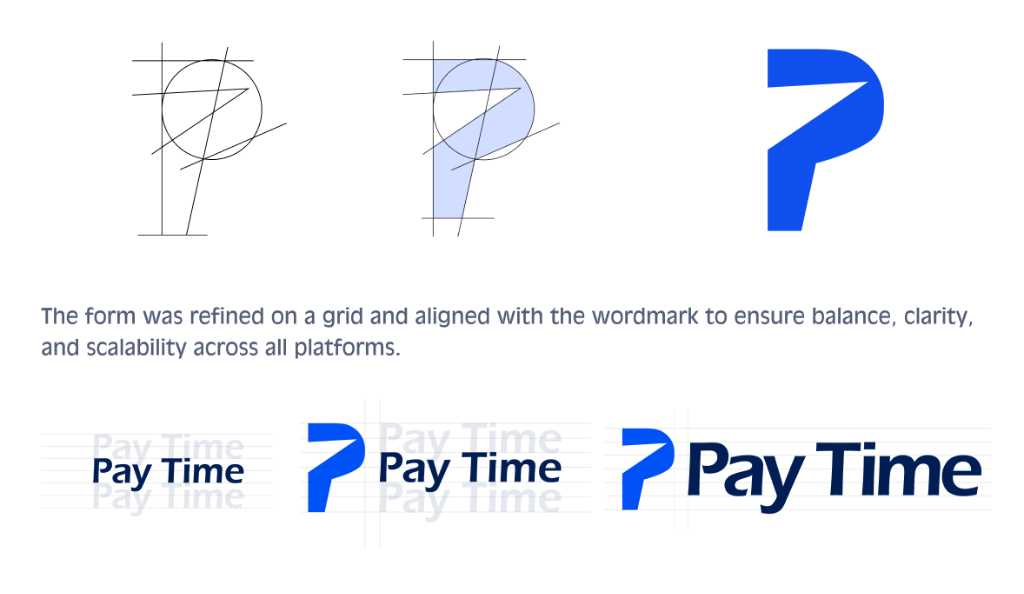
Compass Geometry
Mathematical circle tangents and angle construction establishing the foundational spine of the letter ‘P’.
Directional Negative Cut
Precision diagonal slice opening the counterform, turning a static letterform into a symbol of dynamic forward motion.
Wordmark Grid Lockup
Baseline, cap-height, and x-height optical alignment ensuring harmonious visual weight between the glyph and the PayTime type.
LOGO VARIATIONS FOR MARKETING
Engineered in 3 core lockups to fit any digital layout, application container, or physical asset seamlessly.

Primary Logo

Secondary Logo

Symbol Logo
WHY THIS WORKS
Direct Connection to the Brand Name
The geometric 'P' represents both Pay and Time effortlessly, establishing immediate mental recall.
Clean and Scalable Across All Platforms
From 16px mobile app icons to massive building signage, the silhouette never loses clarity.
Modern FinTech Personality
The electric cobalt and deep navy palette communicates cutting-edge velocity with bank-grade safety.
Easy to Recognize and Remember
A bold, distinctive geometric shape that cuts through saturated visual noise in the digital finance space.
BRAND IN APPLICATION
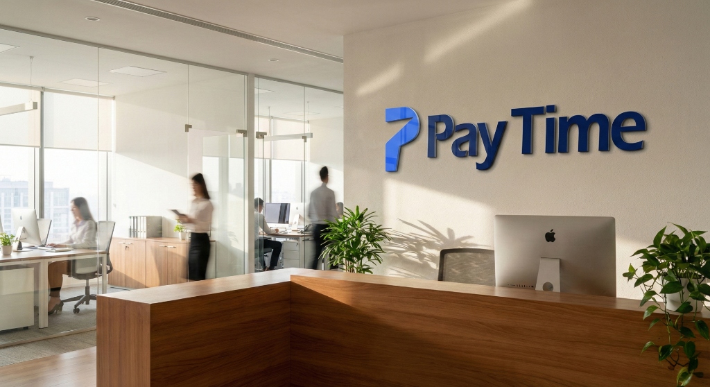
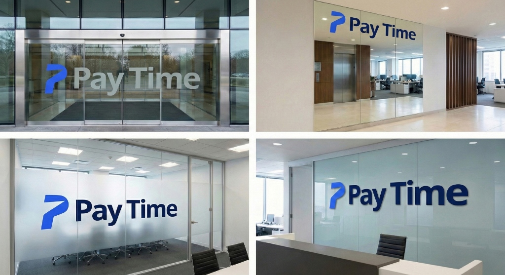
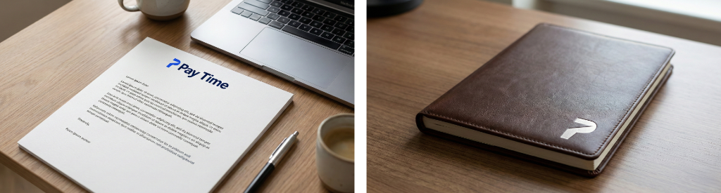
Exploring how the PayTime brand identity scales seamlessly across digital web platforms, executive stationery, corporate office environments, and physical print collateral.
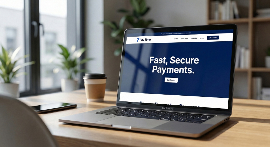
Web Landing Page & Portal
High-converting responsive landing page communicating speed, clarity, and instant cross-border settlement.
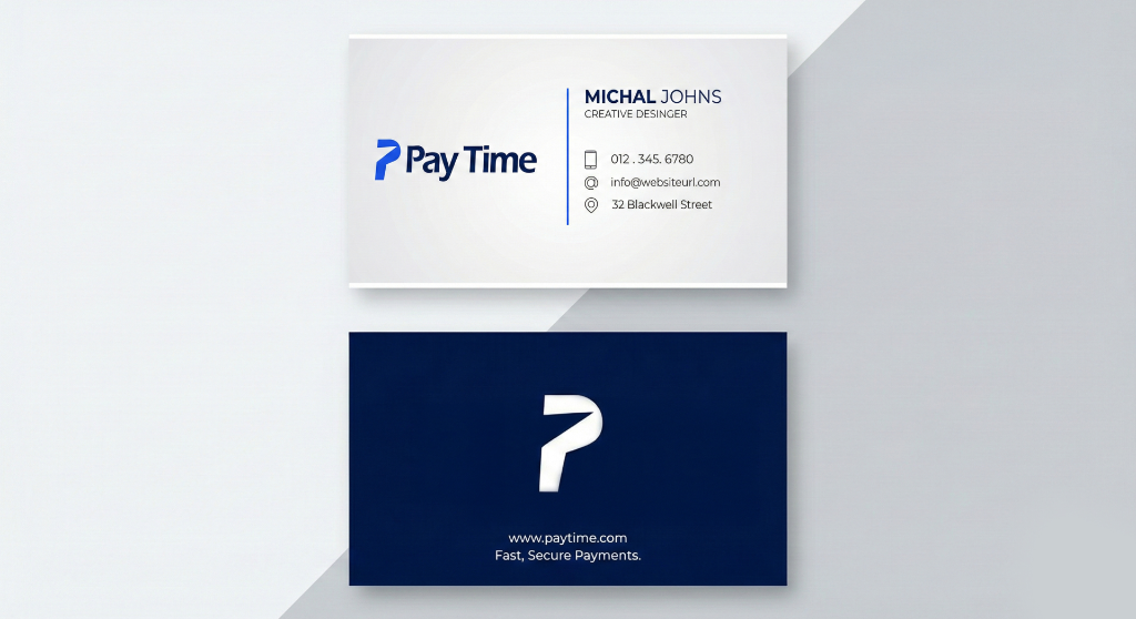
Dual-Tone Business Cards
Crisp white typographic front face paired with deep midnight navy back featuring the bold white symbol mark.